Monday, 14 March 2016

Evaluation Question 5


I wrote my answer to the evaluation question 5 which was 'How did you attract/address your audience?' on Word, then converted it to a PDF format so that I could upload it to Google Drive and embed onto my blog.

Thursday, 10 March 2016

Evaluation Question 1

To present my answer to Evaluation Question 1, I created a tumblr blog here featuring a blog post explaining the ways my magazine uses, develops or challenges forms and conventions of real life media products.

(http://chloewilliamsmedia.tumblr.com/)

Saturday, 5 March 2016

Evaluation Question 2

How does your magazine represent particular social groups?


Colour scheme:

Initially I did not have a set idea as to what I wanted my colour scheme to be but I ended up deciding to stick to quite dark backgrounds which contrast well with the bright, neon looking masthead and cover lines. I feel the glowing, neon text contrasting behind dark colours represents the edgy feel I want to come across to my audience and also links to a part of the genre of the magazine which is electronic/dance music. Although a few colours were used, the colour scheme was kept consistent throughout and they all tied in nicely together. Although the colour scheme was not aimed towards a particular social group, I feel like it will relate to a few social groups as it makes the magazine look professional and realistic which is generally what most people look for when buying a magazine.

Images

The images used in my magazine were important as they were a key part in representing and aiming towards my target audience. For my main image, it was important that the image I decided to use from all of the ones we took was good. The main image denotes a teenage girl posing and looking up, as though she is looking at the masthead of the magazine. As the model is a teenager this links to my target audience as teenagers are predominantly who I'm aiming my magazine towards. Initially, the model was wearing a Christmas jumper so it was important to photoshop this out to make it look like she was just wearing a plain black jumper as this would relate to my target audience more as it is more trendy to wear plain clothing. 

The other images I used inside of my magazine were more specific in representing my target audience, specifically ones who look up to an artist who's name is on the cover.


I created this collage of the image of the model used in my magazine and an image of Lana Del Rey, an artist who is featured inside my magazine and also the main inspiration for the image taken for the magazine. Both have similar body language and facial expressions and they are both posing in front of a nature background, a nice contrast from the stereotypical plain black/white photoshoot background. People who look up to Lana Del Rey, particularly teenage girls, will take an interest in the model who's image was inspired by them and perhaps look up to her due to their fashion sense and body language. 

Generally the social group my magazine is representing are teenagers who have an interest in current music and also more edgier electronic/indie music. They may also have an interest in fashion, the latest pop culture news and going to gigs/festivals. They are not part of a specific subculture like 'goths' or 'emos', they are what people would consider 'popular' and like listening to music they can dance to and also enjoy going out and having fun.

Evaluation Question 6

Thursday, 3 March 2016

Evaluation Question 7

Evaluation Question 4


I created a video on iMovie answering the question "Who would be the audience for your media product?" In the video I included a profile of a typical audience member, including images of the ideal reader of my magazine, my target age range and gender, the interests my target audience may have, explained why my magazine will appeal to people and also included feedback from people in my target age group at college asking if they would want to buy/read my magazine and why. I then exported it and uploaded it to the video sharing site Vimeo and embedded it onto my blog.


Friday, 22 January 2016

Progress update 3


This is my front cover, contents page and double page spread. I recieved some feedback on them and I need to make some adjustments such as
  • Fill the front cover up with more text to ensure it doesn't look too plain
  • Add a price to the cover
  • Make the main coverline stand out more to distinguish between the main cover story and other features
  • Add a neon glow similar to the masthead on the cover to the masthead on the contents page to fit in with the theme of the magazine and look more recongisable
  • Add captions to the images on the contents page
  • Change the double page spread interview font so that it is easier to see and ensure the answers are not in capital letters as some people can find this difficult to read
  • Move the interview more to the right side of the page
  • Make the pull quote stand out more - use a different colour

Tuesday, 19 January 2016

Looking At Previous Student's Work


Analysing Previous Student Work
Name of Magazine
Strengths
Weaknesses
Grade I awarded and reason
 
Unsigned
·         Stuck to a consistent colour scheme of red and, black and white
·         Good ratio of images and text to keep the reader engaged
·         Photographs are good quality and fit in with the genre of the magazine well
·         Grammatical/spelling errors throughout – makes the magazine appear unprofessional
·         Too many fonts used throughout which does not look aesthetically pleasing
C – followed magazine conventions however more effort could have been put in to make the magazine more informative and appear more professional
Behind Closed Doors

·         Consistent colour scheme which link well to the genre of the magazine
·         Used a variety of live gig photos and artists
·         Followed typical magazine conventions on the front cover and contents page.
·         Far too many fonts used throughout the magazine in a variety of places and colours, makes the magazine look very unorganised and unprofessional
·         Too many images used in the double page spread and not enough text to make a good balance
·         Lighting is very poor on a lot of the images again making the magazine appear unprofessional
D – Overall this magazine appeared too messy and unprofessional due to there being too many fonts/images, images constantly repeated throughout and didn’t follow magazine conventions well on the double page spread
Strobe
·         Bright, eye catching main image which contrasts well with the background and masthead
·         Consistent colour scheme of white, blue and black
·         Professional looking contents page
·         Grammatical errors throughout interview – looks unprofessional
·         Text is a bit hard to read on the main cover, could have used a different font/colour to ensure it stands out more
·         Not enough variety – There are only 2 people in the whole magazine
·         Shadow not edited out on contents page image
C -  More effort could have been put in to the double page spread to ensure it looked like a proper magazine for example changing the font and proof reading the interview to correct any errors. Text should be moved around to look more organised
What have I learned from looking at last year’s student work?
I have learnt that it is important to ensure that every aspect of the magazine looks good to make the overall magazine look as good as possible. When there is too much text on a page it can make it look boring and potentially make the reader bored, however when there are too many images on the page it can make the magazine appear unprofessional and messy. It is important that there is a good balance of text and images. I have also learnt that even if the content of the magazine is not that impressive, keeping to a good consistent colour scheme and nice fonts can still improve the overall look of the magazine drastically. I have also learnt that good images are one of the key aspects to make the magazine look as good as possible.
How will I apply this to my own work?
I have learnt that to ensure that my magazine looks as professional and aesthetically pleasing as possible I have to stick to a consistent colour scheme, keep the fonts to a minimum, ensure that there is a good ratio of text and images, always proof read to ensure that the magazine is grammatically correct and that there are no spelling mistakes that may mark me down and be space efficient to make sure that everything is set out nicely.

Sunday, 17 January 2016

Progress update


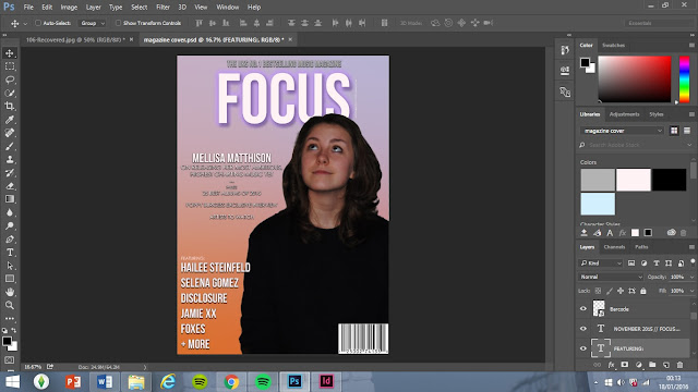
I made several changes to my magazine cover including

  • Photoshopped a picture of my model and placed it on the cover in place of the temporary image of Ellie Goulding
  • Changed the font to make the magazine look more modern
  • Created a gradient background to look more aesthetically pleasing than a block colour
  • Created a coverline and subheading
  • Added essential information next to the masthead
  • Ensured that the magazine looks well organised and not too cluttered with text
  • Kept fonts to a minimum